Market research
HCP Portal Audit and Report
Get access to a comprehensive audit and in-depth analysis of 28+ HCP portals across Europe and the US.
AuthorTeodora Corbu
CategoryPharma Innovation

Pharma portals have evolved fast over the last few years. What began as simple content repositories for healthcare professionals has changed into complex digital platforms. These platforms support education, engagement, data collection, and omnichannel strategies.
Despite significant investment, many HCP portals face the same challenge: low adoption and limited engagement from HCPs.
In most scenarios, the challenge lies not in the content, technology, or compliance but in the user experience (UX).
Common UX issues quietly undermine even the most sophisticated digital strategies. This is making portals hard to navigate, time-consuming to use, and frustrating for busy HCPs. When UX fails, HCPs disengage, data quality drops, and digital ROI suffers.
Unlike consumer platforms, HCP portals operate in a uniquely complex environment:
Strict regulatory and compliance constraints.
Highly specialized content.
Multiple-use roles and access levels.
Time-poor users making critical decisions.
HCPs don't browse pharma portals for inspiration. They log in with a clear purpose: to quickly find specific information, complete a task, or access relevant resources. If the experience feels slow, confusing, or cluttered, they leave and often don't come back.
Poor UX in HCP portals leads to:
Low HCP adoption after launch.
Shallow engagement and short session times.
Underused features and content.
Reduces trust in digital initiatives.
On the other hand, a well-designed portal helps pharma companies:
Increase portal adoption organically.
Improve content discoverability.
Support omnichannel strategies more effectively.
Collect higher-quality data and insights.
In short, UX is the bridge between building and launching an HCP portal that's compliance-driven and one that's based on real-world HCP behavior. When that bridge is weak, everything built on top of it suffers.
Get access to a comprehensive audit and in-depth analysis of 28+ HCP portals across Europe and the US.
Despite differences in therapeutic areas, geographies, and technology stacks, many portals share the same recurring UX problems. These issues are rarely the result of poor execution. They usually stem from structural constraints such as compliance requirements, legacy systems, and complex internal stakeholder dynamics.
Below are the most common UX issues observed in pharma portals. Let’s break down each issue, explain its root causes, and outline practical remediation strategies to improve clarity.
The issue
Pharma portals often show too much information. Dashboards become crowded with various content, all vying for attention.
Impact on HCP experience
Increased cognitive load.
Difficulty identifying primary actions.
Longer time to first meaningful interaction.
For time-constrained HCPs, an overloaded dashboard creates friction before value is delivered.
How to fix
Apply clear visual hierarchy and prioritization.
Limit dashboards to 1-3 primary actions per user role.
Use progressive disclosure to reveal secondary information only when needed.
Design role-based dashboards aligned with real HCP workflows.
The issue
Navigation often reflects internal taxonomies rather than user needs. Branded or regulatory terms shape menus, confusing HCPs.
Additionally, portals may rely heavily on deep menu hierarchies that require multiple clicks to reach essential information.
Our HCP Audit and Report has revealed that many HCP portals lack basic navigation features (like breadcrumbs for context or filtering options). Impact on user journey
Difficulty locating relevant content.
Increased reliance on search.
Higher bounce rates and session abandonment.
When users can't quickly find what they need, they perceive the portal as inefficient, regardless of content quality.
How to fix
Redesign information architecture based on user tasks, not internal structures.
Simplify navigation levels and reduce depth.
Implement robust, optimized search with filters and suggestions.
Use language that reflects how HCPs think and search for information.
While many HCP portals provide a solid foundation with diverse content and reliable information, design and user experience can be significantly improved.
Navigation remains a critical weakness; they often lack advanced features such as filtering and breadcrumbs that make content easier to find.
To create impactful portals, pharma companies must prioritize user-centricity by conducting thorough user testing to address unclear labeling and complex navigation. Moreover, portals should be regularly improved, with regular feedback and iterative enhancements.
– Quote from the HCP Audit and Report
The issue
Many portals have the same interface and structure for all users. They do not consider the different needs of healthcare professionals.
Impact on user behavior
Perceived lack of relevance.
Reduced engagement over time.
Missed opportunities for meaningful personalization.
A generic experience rarely supports advanced use cases such as targeted education or contextual decision support.
How to fix
Introduce role- and specialty-based UX patterns.
Adapt content visibility based on user profiles and permissions.
Personalize interfaces using behavioral and contextual data.
Focus on relevance rather than content volume.
The issue
Security needs often lead to complex login and registration processes, implemented with little UX focus.
Lengthy forms, unclear instructions, and poorly designed multi-step flows create significant friction before users access any value.
Impact on digital experiences
High drop-off rates during registration.
Delayed first value moment.
Negative perception before engagement begins.
First impressions are critical, and onboarding is often where portals lose users permanently.
How to fix
Streamline onboarding to the minimum required steps.
Clearly communicate why you need this information.
Provide visual progress indicators.
UX-test log-in flows with real users.
The issue
Many organizations still design portals for desktop use only. Mobile and tablet versions often lack touch-optimized functionality for real-world use.
Impact on user engagement
Difficult navigation on tablets and mobile devices.
Reduced usability during clinical workflows.
Lower engagement outside traditional office settings.
Given how frequently HCPs use tablets and smartphones, this represents a significant usability gap.
How to fix
Adopt a mobile-first UX design approach.
Optimize layouts for touch-based interaction.
Prioritize performance and loading speed.
Test usability across devices commonly used by HCPs.
The issue
Accessibility is often treated as a compliance checkbox rather than a core UX principle. Low contrast, small typography, complex forms, and poor keyboard navigation are common issues.
Impact on HCP experience
Reduces usability for users with visual or motor impairments.
Increased compliance and legal risk.
Exclusion of a portion of the user base.
Accessibility shortcomings affect usability for everyone, not just those with declared disabilities.
How to fix
Design according to WCAG guidelines.
Conduct accessibility audits regularly.
Use inclusive typography, contrast, and interaction patterns.
Integrate accessibility checks into the design and development process.
The issue
Organizations frequently rely on assumptions when designing medical portals, leading to rare or reactive UX improvements.
The HCP Portal Audit and Report revealed many cases in which features or elements that healthcare providers would find necessary or useful were absent from the HCP portals used.
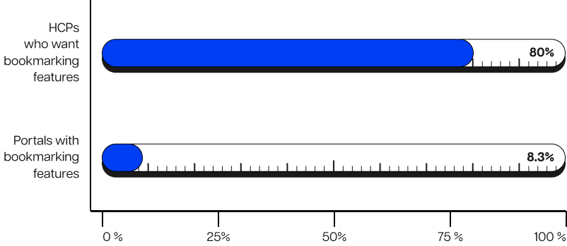
For example, 80% of HCPs expressed interest in bookmarking features, but only 8.3% of HCP portals provided them.
Impact on HCP experience
Misalignment with real-world workflows.
Persistent usability issues.
Reduced long-term adoption.
Without continuous feedback, portals fail to evolve alongside user needs.
How to fix
Conduct regular usability testing with HCPs.
Use qualitative and quantitative UX data.
Iterate regularly rather than relying on large redesigns.
Treat UX as an ongoing capability, not a one-time project.
Improving UX in pharma portals is not about copying consumer apps or removing necessary controls. It requires a principled approach that balances usability, compliance, and technical reality.
Let's discuss the core design principles that consistently drive better adoption and engagement on pharma portals.
A common mistake in pharma portal UX is designing around internal teams, brands, or content ownership. While this may simplify governance, it rarely reflects how HCPs actually work.
Effective UX starts by understanding:
What tasks HCPs are HCPs trying to complete?
When and where do they access the portal?
What information do they need at each stage?
Portals around real workflows reduce friction and shorten the path to value. This principle requires close collaboration between UX designers, product owners, and medical teams to translate clinical realities into intuitive digital experiences.
In regulated environments, it is tempting to repeatedly add features to justify investment or satisfy multiple stakeholders. Over time, this leads to bloated interfaces that are difficult to navigate.
A principled design process prioritizes:
Clear primary actions.
Focused interfaces.
Minimal cognitive load.
Clarity does not mean removing functionality. It means structuring features to align with user priorities and reveal complexity only when necessary.
Compliance requirements are often implemented as additional layers that disrupt the user journey. Treating compliance as an afterthought makes it a visible obstacle rather than an integrated part of the experience.
Better outcomes are achieved when:
You consider compliance from the earliest design stages.
You translate regulatory constraints into clear, user-friendly interactions.
Transparently explain mandatory steps.
When users understand why certain actions are required, friction decreases and trust increases.
Not all HCPs engage with portals at the same level. Some log in occasionally for specific information, while others become frequent users.
Effective HCP portal UX supports this spectrum by:
Allowing quick access to essential content for light users.
Offering deeper functionality for advanced users.
Avoiding forced engagement patterns.
Progressive engagement enables portals to grow with the user rather than overwhelming them from the first interaction.
UX in pharma portals should not be a one-off design phase followed by years of stagnation. User needs, regulations, and digital expectations evolve constantly.
A mature UX approach includes:
Continuous usability testing.
Ongoing measurement of user behavior.
Iterative improvements based on data and feedback.
This principle shifts UX from a project mindset to a useful capability embedded in the portal’s lifecycle.
Traditional pharma websites' metrics, such as logins or page views, provide limited insight into user experience quality. Thorough UX improvement requires more meaningful indicators.
Effective metrics include:
Task completion rates.
Time to first value.
Feature adoption per user engagement.
Drop-off points in critical flows.
These metrics allow teams to identify friction points and prioritize improvements with clear business impact.
In pharma portals, UX improvements are often viewed as subjective or aesthetic. In reality, they have direct and measurable consequences for both digital performance and broader commercial and medical objectives.
Pharma organizations typically see improvements across several critical dimensions when they address UX issues regularly.
Increased HCP adoption and retention
An intuitive, user-centric, relevant, and efficient portal lowers the barrier for new users. Clear onboarding, simple interfaces, and easy navigation help healthcare professionals return. This prevents them from leaving the platform after their first use.
More effective content usage
Improved UX increases content discoverability and contextual relevance. Users are more likely to access, understand, and use educational materials, clinical resources, and services when they are easy to find and clearly presented.
Higher-quality data and insights
When a portal improves user experience, HCPs complete more interactions, forms, and workflows accurately. This leads to better-quality data, more reliable analytics, and stronger foundations for personalization and omnichannel strategies.
Better alignment between digital investment and ROI
UX-driven portals maximize the value of existing technology and content investments. Instead of adding new features, organizations can unlock impact by improving how users interact with what already exists.
Good pharma UX design changes portals from simple compliance tools into valuable digital assets. These assets help build long-term trust and engagement with healthcare professionals (HCPs).
A lack of expertise rarely causes common UX issues in pharma portals. They are the result of complex constraints, competing priorities, and evolving digital expectations.
By focusing on clear, thorough UX design grounded in real HCP workflows, pharma companies can improve portal use. This approach helps boost engagement and business results while maintaining compliance.
Addressing UX is not about making pharma portals look better. It’s about making them work better for the people they are built for.
Suggested further reading:

Teodora Corbu
Marketing Specialist @Digitalya
Blending technology with creativity, Teodora turns cups of coffee into carefully written thoughts. With the power of the Oxford comma and a bit of magic, she brings words closer to people.

Healthcare professionals expect clarity, speed, and structure from every digital touchpoint. Yet many medical portals still feel heavy and fragmented, leading to inconsistent digital engagement across channels. The solution lies…

Decision-makers in pharmaceutical companies, especially those in marketing and omnichannel roles, have the difficult task of ensuring regulatory compliance across all channels and touchpoints, from clinical development to patient communications.…
AI technology shifted from curiosity to critical capability. Most big pharmaceutical companies discuss artificial intelligence. Yet, few can say how it fits into their work. They also struggle to explain…