Why does “interactive” fail when it’s just a format?
Interactive pharma content is often treated like a production upgrade: more polished modules, richer video, “something clickable.”
But in an HCP portal, interactivity only matters when it helps an HCP complete a task with less effort.
That’s the difference between engagement theater and real utility.
If the portal experience doesn’t shorten time-to-answer, reduce uncertainty, or make the next step obvious, HCPs don’t return, no matter how modern the format looks.
Executive summary
Interactive HCP portal content works when portals help HCPs:
- Find what they need fast (without searching like librarians)
- Move from content to action (a clear next step, not a dead end)
- Use tools in context (decision flows, calculators, and guided exploration)
- Complete workflows that matter (e-sampling requests, virtual detailing journeys)
- Return with less friction (because the portal saves time, not because “it’s nice”)
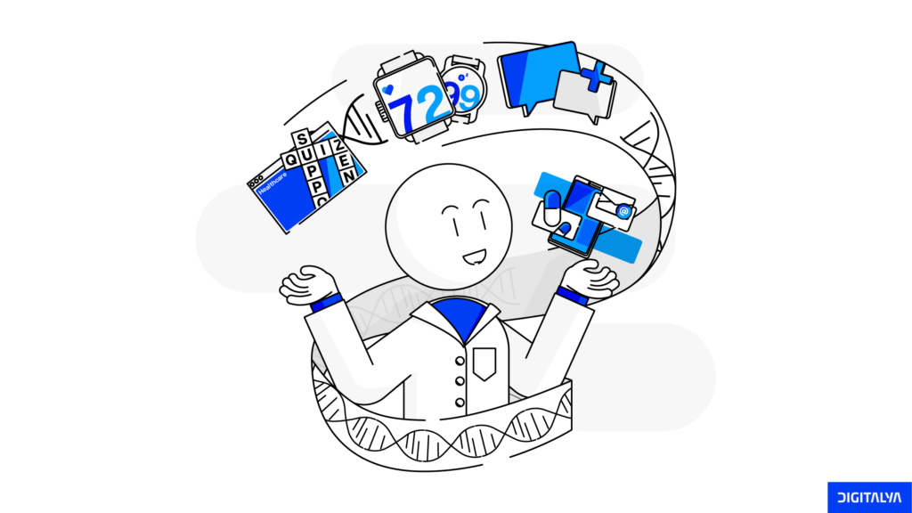
This article shows what interactive pharma content looks like within an HCP portal and how specialized capabilities such as prescribing tools, digital sampling, and clinical decision support can transform content from “something to consume” into “something to use.”
What is interactive content for HCPs?
Interactive content is any portal experience that adapts to an HCP’s intent and enables them to do something, not just read, watch, or download.
In any HCP portal, that typically means content paired with functionality, such as:
- Guided learning (cases, quizzes, branching scenarios, micro-modules)
- Guided exploration (filters, comparisons, interactive visualizations, “show me what matters”)
- Decision support patterns (calculators, eligibility flows, structured pathways)
- Action workflows (request samples, continue a journey, generate a next step)
So the “interactive” part isn’t the animation. It’s the workflow logic and context that reduces effort and makes the portal useful in that moment.
Interactive pharma content vs. Digital pharma content
| Interactive pharma content | Digital pharma content | |
| What it is | Content + portal mechanics that guide action | Digitized assets distributed online |
| Primary value | Reduces effort and supports completion | Informs and explains |
| Typical formats | Modules, branching cases, calculators, guided flows, dashboards | PDFs, videos, slide decks, static pages |
| What success looks like | Task completion, repeat usage, next-step conversion | Views, time on page, downloads |
| Failure mode | “Clickable but pointless” interactions | “Useful but passive” consumption |
A portal can host high-quality digital content and still feel “dead” if nothing helps the HCP reach an outcome quickly.
Key takeaways
- Interactive pharma content is strongest when it behaves like a tool, not a media format.
- The portal’s job isn’t to increase clicks, but to reduce time-to-value for HCPs.
- The most effective interactivity usually happens in small amounts: guided discovery, decision flows, and next-step prompts.
- Specialized capabilities (prescribing tools, e-sampling, virtual detailing) make content actionable.
- If you can’t decide the workflow outcome in one sentence, you probably don’t have interactivity, just decoration.
Dan Johnson, Business Unit Head at Takeda, SwitzerlandHCPs need to trust that pharma is in it for the long term, putting patients first and enabling access to medicines. This starts with making sure team incentives, actions, and investments are aligned to solving the biggest problems that HCPs and the health ecosystem are facing.
The four stages of interactive content in an HCP portal
This type of content becomes valuable in an HCP portal when it supports the way HCPs actually move through a task. Most portal journeys follow a simple progression:
- Find what is relevant
- Learn what is necessary
- Decide what applies
- Act on the next step
That’s why we’ll use a four-stage lens:
Discover → Learn → Decide → Act
These stages aren’t a rigid funnel, and they’re not meant to describe every HCP in every moment. They’re a practical way to design interactive pharma content that doesn’t stop at “engaging” and delivers a real outcome within the portal.
The outcome could be completing a micro-module, using a prescribing tool, or submitting a sample request.
In the next sections, each stage is broken down:
- What interactive content looks like in a portal,
- What to build first (the minimum lovable version)
- What to measure beyond views and downloads
Interactive content can’t succeed if HCPs can’t find it quickly. That’s why the first stage isn’t “create better modules,” it’s make discovery effortless.
Stage 1: Discover — help HCPs find relevant content fast
Many HCP portals lose users due to slow discovery. If an HCP can’t quickly confirm “I’m in the right place,” they won’t explore; instead, they’ll bounce, search elsewhere, or go back to whatever tool is already part of their routine.
Interactive content starts at discovery: guided paths that reduce time-to-answer and make the next click obvious.
What it looks like in an HCP portal
- Intent-based entry points instead of one big library: “I need dosing,” “I need clinical trial data,” “I need resources for practice.”
- Search that understands clinical language (synonyms, abbreviations, common queries) and improves with analytics.
- Filter + refine patterns that behave like a tool (e.g., indication, patient data, evidence type, treatment line)
- Guided navigation that suggests where to go next (“If you’re treating X, start here”)
- Progressive disclosure: show the 3-5 most relevant items first, with optional depth, not a wall of assets.
- Contextual recommendations at the end of the page: related content, related tool, or the next workflow (e.g., form evidence to calculator, to sample request)
What to build first
You don’t need personalization engines to improve discovery. Start with:
- A curated “Start here” layer above the library (3-6 tiles mapped to top intents)
- High-signal filters (fewer, better) plus a strong “reset/refine” UX
- A search results page that teaches the portal: track “no results” queries, add synonyms, and improve tagging weekly
- Related content rules (manual curation is fine in phase 1)
What to measure (beyond pageviews)
If discovery is doing its job, you’ll see improvements in:
- Time-to-first-relevant-click (how fast they land on something useful)
- Search success rate (sessions with a click after searching)
- “No results” and repeated searches (signals of poor findability)
- Next-step conversion from context pages (do they continue or exit?)
Stage 1 is where interactive pharma content either earns trust or gets ignored. If discovery feels like browsing a document repository, even the best modules and tools won’t get used.
But when an HCP portal helps users reach the right content quickly, through intent-based entry points, high-signal filters, and search that reflects clinical language, interactivity becomes practical from the very first click.
The goal isn’t to add more content to the library. It’s to reduce time-to-value and make the next step obvious. Once discovery works, you can build deeper experiences on top of it, which is where Stage 2 comes in: interactive learning that feels like clinical thinking, not e-learning.
Once discovery works, the next barrier is time. HCPs won’t “consume content” the way teams expect; they’ll use what fits the moment. That’s where Stage 2 comes in: learning experiences designed around real clinical thinking, not long-form e-learning.
Stage 2: Learn — interactive learning
Once HCPs can find the right path, the next question is whether the portal helps them learn in a way that matches how they think and work.
Stage 2 is where interactive content either becomes genuinely useful or starts to feel like “training content” that gets postponed indefinitely.
In an HCP portal, learning works best when it’s short, scenario-led, and decision-shaped. HCPs rarely want to “take a course.”
They want to answer a question, confirm an approach, or understand why something matters, quickly.
What it looks like in the real world
- Case-based micro-modules: a brief patient scenario → a decision point → rationale → evidence snippet → takeaway.
- Branching pathways: “If A, show this; if B, show that”; enough to feel tailored without being complex.
- Knowledge checks that unlock depth: 1-3 questions that lead to “show me the why,” not a score for the sake of scoring.
- Interactive visuals that let HCPs explore (toggle endpoints, filter subgroups, compare outcomes) instead of static slides.
- Save/resume and “continue where you left off” so learning respects fragmented time.
What to build first
You don’t need a full LMS to do Stage 2. Start with:
- One reusable module template (same components every time: scenario → decision → rationale → evidence → summary)
- 3-5 micro-cases around high-frequency portal intents (patient selection, dosing moments, monitoring, switching).
- A basic progress state (completed/ in progress/ saved) and a “continue” entry on the portal home.
- One interactive component per module (a branching choice, a simple calculator, or a toggleable visual).
What to measure (beyond completion rate)
Completion is useful, but Stage 2 success is about continued value:
- Drop-off point by step (where do they quit: scenario, evidence, quiz, summary?)
- Time-to-complete (too long = avoidance; too short = superficial)
- Return-to-learn rate (do they come back within 7-14 days?)
- Next-step conversion (after the module, do they go deeper?)
Stage 2 is where interactive pharma content proves it can be more than “engaging.” If learning experiences are short, scenario-led, and built around real decision moments, they stop feeling like content to consume and start feeling like help.
Once you reliably move an HCP from question → context → takeaway → next step, you’re ready for Stage 3 — where interactivity offers clinical decision support through prescribing-adjacent tools and structured pathways.
If Stage 2 helps an HCP understand what matters, Stage 3 is where portals help them apply it. This is the shift from interactive learning to interactive guidance; tools and pathways that support decisions with clear boundaries and references.
Stage 3: Decide — interactive content becomes guidance
Stage 3 is where interactive pharma content stops being “education” and becomes decision support within the portal. Not in the sense of replacing clinical judgment, but in removing friction around applying information: confirming eligibility logic, checking practical steps, and structuring what to consider next.
This is also where teams need the clearest guardrails: prescribing tools must be designed to be accurate, transparent, and compliant, with clear references and boundaries.
What it looks like in an HCP portal
- Guided pathways (scenario → step-by-step considerations → relevant references): essentially a navigable checklist that helps an HCP confirm “what applies here?”
- Eligibility/ appropriateness flows: structured questions that map to clinical criteria and route the HCP to the right content or evidence section.
- Calculators: dosage-related math, titration support, risk scores, or monitoring schedules, always paired with assumptions and references.
- Interactive summaries of complex information: “show me the key points, then let me expand.”
- Next-best-step prompts: after the output, the portal suggests the most relevant follow-up (e.g., safety section, patient materials, sample request, etc.)

What to build first
Start with one high-frequency “decision moment” and build a single, excellent tool rather than five mediocre ones:
- One guided flow for a common scenario (patient section, switching, initiation, monitoring)
- A simple calculator template with:
- Clear inputs and units
- Visible assumptions
- A “how this was calculated” hint
- Links to supporting references
- A structured output screen that offers:
- The result
- What to check next
- Direct links to the exact supporting content (not a generic PDF download)
What to measure (beyond clicks)
Prescribing support tools should be measured like utilities:
- Tool completion rate (start → output)
- Repeat usage (do HCPs come back to the tool?)
- Output-to-next-step conversion (what do they do after getting the result?)
- Error and abandonment signals (confusing inputs, missing units, unclear outputs)
Stage 3 is where interactive content earns a “utility” role in an HCP’s routine. When portals provide explainable pathways and calculators that help HCPs apply information quickly, with clear references and guardrails, interactivity becomes guidance rather than decoration.
From there, the next step is Stage 4: turning guidance into action through e-sampling and virtual detailing workflows.
Once an HCP has clarity, the portal needs to support momentum. Otherwise, the journey ends with “good to know.” Stage 4 is about turning insights into next steps through workflows such as e-sampling and virtual detailing.
Stage 4: Act — interactive content becomes a workflow
In Stage 4, we move on from content being “useful” to becoming operational. If a portal can help an HCP discover, learn, and decide, but can’t support a next step, the experience still ends like a library: informative, then forgotten.
In an HCP portal, “Act” usually means two things:
- Enabling a compliant e-sampling workflow, and/or
- Enabling a coherent virtual detailing journey that continues beyond a single interaction.
This is where portal design, integration, and governance matter as much as content.
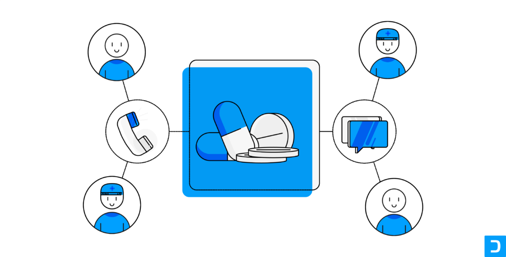
E-sampling — turning interest into a compliant request flow
What it looks like in an HCP portal
- A contextual CTA (“Request a sample”) placed where intent is highest: after patient selection, dosing, or a relevant module, not buried in navigation.
- A guided flow that feels like a form, only where it must:
- Validate HCP identity/eligibility (where required)
- Capture request details
- Confirm and create a traceable record
- A status view: what was requested, what’s pending, and what happens next.
What to measure
- Request start → completion rate (drop-off by step)
- Time-to-fullfillment (where the process slows down)
- Repeat requests per HCP (a proxy for workflow usefulness)
- Support requests/ failed requests (signals of friction)
Virtual detailing — from one-off content to a guided journey
Virtual detailing works best when it’s not treated as “a video in the portal.” The portal’s value is continuity: the ability to move an HCP through a short, modular journey that adapts to what they care about and supports follow-up.
What it looks like in an HCP portal
- A choose-your-path journey made of short segments:
- Overview → clinical scenario → evidence
- Deep dive → safety/monitoring → practice tools
- Rep-enables continuity:
- Pre-call: what the HCP viewed, what to recommend next
- Post-call: recap + next module + resources
- Interaction mechanics that keep it alive:
- Save questions for follow-up
- Request additional information
- Continue where you left off
What to measure
- Segment completion and progression (do they move to the next step?)
- Return rate to the journey within 14 days
- Follow-up actions (requests, saves, booked interactions, downloads where relevant)
- Drop-off points (which segment loses them and why)
Stage 4 is where interactive content becomes a portal capability, not just a content strategy. When e-sampling and virtual detailing are designed as in-context workflows, with status, continuity, and measurable next steps, the portal stops being “a place to visit” and becomes “a place to get things done.”
When the four stages work together, the portal stops behaving like a content repository and starts behaving like an experience: discover → learn → decide → act, with measurable outcomes at each step. The checklist below summarizes what to validate before scaling.
Recap: a practical checklist for interactive pharma content in an HCP portal
You can use this as a quick check before you build interactive content in your portal:
Discover
- Do you have intent-based entry points?
- Can an HCP find a relevant asset in under a minute?
- Are filters high-signal and consistently tagged?
Learn
- Are learning modules scenario-led and 3-7 minutes by default?
- Can users save and resume without losing progress?
- Does each module end with a clear next step?
Decide
- Are decision tools explainable and easy to complete?
- Are inputs/outputs unambiguous?
- Do you have a plan for versioning and content currency?
Act
- Can users complete an e-sampling request without leaving the portal?
- Is there a track-my-request experience?
- Is virtual detailing build as a modular journey, not a single long presentation?
Measurement
- Are you tracking completions and next-step conversion, not just views?
- Do you review search queries and drop-offs monthly and iterate?
Key takeaways
- Interactive pharma content works when it behaves like a tool.
- The portal’s job is to reduce time-to-value: find fast, learn fast, decide confidently, act easily.
- The strongest experiences combine interactive content with portal functionality.
- Measure success through completion, repeat usage, and next-step conversion — not views alone.
- If you build interactivity with clear outcomes and governance, the portal becomes a place HCPs return to because it saves them time.